 By
By The color and material selections of a space is about more than how it looks. It reflects the charisma of the occupant and how we feel in the room. Whether the occupant is serious and formal or loose and relaxed, crafting a design to the client’s desires while maintaining functionality is an art. In a world with an endless and ever-changing selection of colors, materials, fixtures, furnishings, and more, perfecting a design requires high attention to detail. Design trends are constantly evolving. The fundamental concepts of color theory and how material and color selections affect our emotions have stood the test of time. This serves as a guide for crafting the perfect space.
- Fundamentals of Color
- Identifying Colors
- Colors and Senses
- Considerations when Choosing Colors
- Color Schemes
- How Colors and Materials Work in Chief Architect
- Color and Material Features in Chief Architect
- Resource Links
Fundamentals of Color
There are numerous systems people use to define and organize colors. For this blog article, we will focus on the basics of Color Theory and its application to Chief Architect.
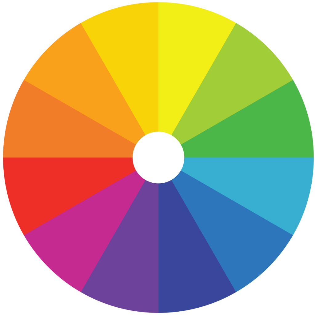
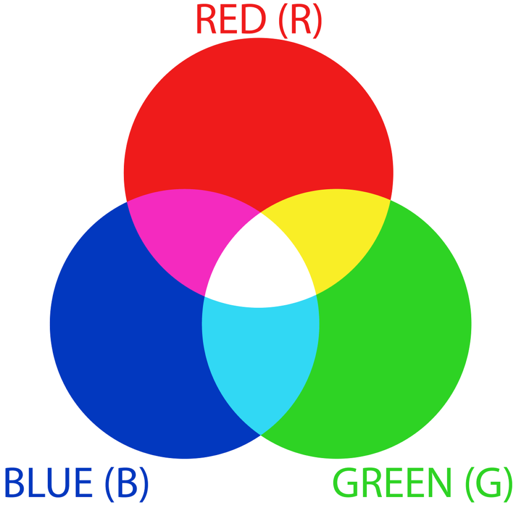
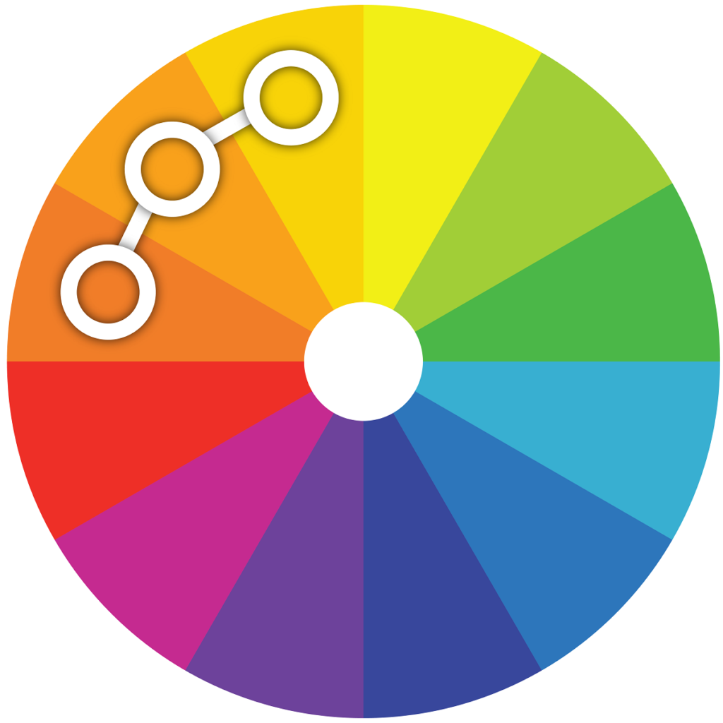
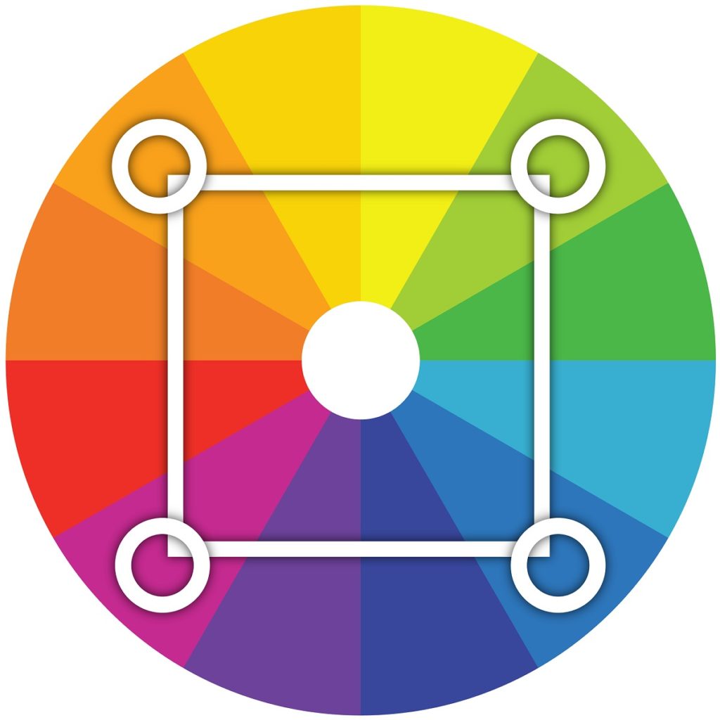
Color Theory provides basic guidance to recognizing and organizing color. Color Theory is based on the idea that there are three primary colors of red, yellow, and blue and by combining them we can form secondary colors and tertiary colors. For example, by mixing the primary colors of blue and yellow, we form the secondary color green. By mixing the secondary color green and the primary color yellow, we form the tertiary color yellow-green, and so forth. This combining of colors is laid out on the Color Wheel, which is a quick and easy way to see how colors are organized and mixed.
Identifying Colors
Colors can be defined in a stated term, such as “blue”, and also a numerical value. There are many models for defining a color’s numerical value. We are going to discuss the two models used in Chief Architect: HSL (Hue, Saturation, and Luminance) and RGB (Red, Green, Blue). These two color models are simple to understand and have easy to recognize color notations.
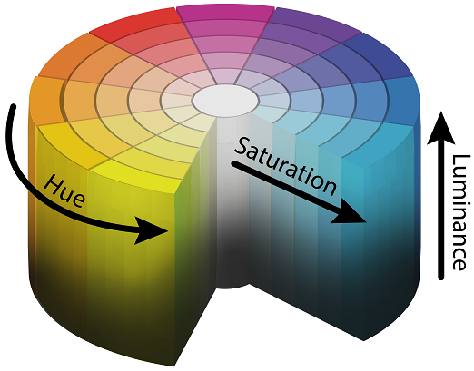
The first color model used in Chief Architect is the HSL color model. The HSL (Hue, Saturation, and Luminance) color model distinguishes colors based on the Hue, Saturation, and Luminance displayed by each color.
- Hue is the common distinction between colors positioned around a color wheel. The three basic hues are the primary colors of red, yellow, and blue. In Chief, the hue is measured as an angle around the color wheel ranging from 0° – 359°.
- Saturation is the quality of a color’s purity, or “intensity”. In Chief, this is measured as a percentage from 0 – 100%.
- Luminance, sometimes referred to as the “lightness” or “brightness” of the color, is the quality of lightness or darkness in a color; that is how much light it reflects or absorbs. In Chief, this is measured as a percentage from 0 – 100%
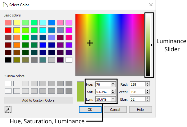
Identifying colors based on their Hue, Saturation, and Luminance is easy in Chief Architect. When selecting a color, there is a color spectrum you can select a color from. There are fields for the Hue, Saturation, and Luminance that will update based on your selected color. If you have a specific color in mind and know its HSL values, you can type the values into the fields and the program will update your chosen color. There is also a slider for the Luminance to see how colors range from light to dark.
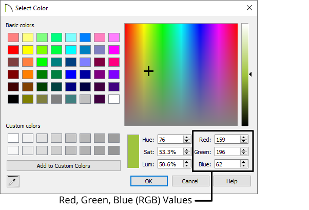
The second color model used in Chief Architect is the RGB color model. The RGB color model is an additive model that defines a color based on the amount of red, green, or blue light present to form a color. This color model is commonly used when viewing colors on a screen. Screens are made up of thousands of pixels. Each pixel is illuminating various levels of red, green, and blue light to produce the color you see on the screen. Each color red, green, and blue is assigned a value ranging from 0 – 255. The lower the value, the closer it is to black, and the higher the value, the more pure the color is. If all three colors have a value of 0, no color is added and we see the color black. If all three colors have a value of 255, the purest form of each color is present and we form the color white.
Chief Architect makes it easy to identify and specify colors based on their RGB values. When selecting a color, there is a color spectrum you can select a color from. There are three fields for the RGB values. When you select a color from the spectrum, these fields will update. If you have a specific color in mind and know the RGB values, you can simply type in the RGB values.
Colors and Senses
Colors can have a wide-ranging effect on our senses. This is advantageous; as it allows designers to make color and material selections that reflect the occupant’s personality and can be a cost-effective method for improving the space.
Warm colors (red, orange, yellow) make the apparent temperature of a space rise. Cozy rooms are often associated with warm colors. Introducing warm colors can make objects or rooms appear closer than they actually are which is referred to as “Advancing”. Warm colors can also make large rooms look smaller.
- Reds are seen as warm, exciting, and stimulating or full of tension and danger. Using limited amounts of red can help balance blues and greens, adding cheer and energy. Strong reds and greens together in large areas can bring tension/stress.
- Oranges produce stimulating feelings and are often seen in neutral color schemes.
- Yellows often bring cheer or humor and effect of brightness, while suggesting less tension than reds and oranges. Yellow tints (creams, beiges) are often considered safe colors.
Cool colors (blue, green, violet) make the apparent temperature of a space lower. Cool colors are associated with formality and reserve. Can make objects or rooms appear further away than they actually are which is referred to as “Receding”. Cool colors can make small rooms look larger.
- Greens are considered the cool colors closest to warm. Green colors often bring balanced schemes for calm, restful, and peaceful associations from nature.
- Blues are the coolest of the cool colors, suggesting rest, calm, and peace. When overused or too strong can generate depression and gloom. Blues can help accent warm color schemes.
- Violets are often seen as artistic, but at risk of conveying ambiguity. Purples even more strongly suggest tension, but can also be seen as royal.
Neutrals, such as warm or cold shades of grays, browns, and tans, contain impressions of diluted forms. Neutral colors make good background colors, but can be dull. Browns and tans are neutralized reds and yellows. Neutral hues with low saturation can appear homelike. Neutral hues with high saturation can appear masculine.
Whites and near whites suggest clarity, openness, and brightness. Whites are often a safe color to use and are associated with cleanliness and sanitation, but can feel forced and empty. White colors can imply modernity and high style.
Blacks can be powerful accent colors but can be depressing if used in excess. Black colors can suggest dignity and formality. Extensive use should be limited to spaces occupied for brief periods of time, such as bathrooms. Dark gray colors can share these qualities.
Considerations when Choosing Colors
Lighting can shift color perception. The tints of lighting, shadows, how much light is present, and other considerations must be taken into account when making color and material selections. For example, the lighting at a store where you are choosing a color or material may be indoors with commercial fluorescent lighting and no natural sunlight, but where the color or material will be located in the space may get lots of natural light, even sunsets. Try to keep the lighting conditions of the space in mind when making material selections. If possible request a sample to evaluate the color or material in the final space it will reside and view it at different times of the day, since lighting can change throughout the day.
Colors can also help make up for shortcomings of the space. By selecting appropriate colors for a given situation, designers can help make up for the structural limitations, while crafting the space to the client’s desires. Here are a few common tips for how color selection can alter the perception:
- If the space is too small and the goal is to make it feel larger, use light or cool colors. These colors allow light to reflect in the space which will make the space appear larger.
- If the space is too large and the goal is to make it feel smaller, use dark or warm colors. These colors absorb light, which will make the space feel more confined and cozy.
- Painting a room’s ceiling a lighter or cooler color than the walls can make the room’s height appear taller.
- Painting a room’s ceiling a darker or warmer color than the walls can make the room’s height appear shorter.
- You can make a space feel narrow by painting the ceiling and back wall a lighter color than the side walls.
- You can make a space feel wider by painting the ceiling and back wall a darker color than the side walls.
Colors can have different cultural significance throughout the world. A color may stand for peace and serenity in one culture but could signify calamity and unrest in another. Getting to know the space’s occupant, their journey, the charisma they would like the space to present, and how it will be used can help designers choose appropriate colors and ensure the cultural values of the client are respected.
Color Schemes
A color scheme is a specific selection of colors together in a space. Color schemes serve as a guide for picking color arrangements.
Monochromatic: Uses a single hue in a wide range of saturation and luminosity.
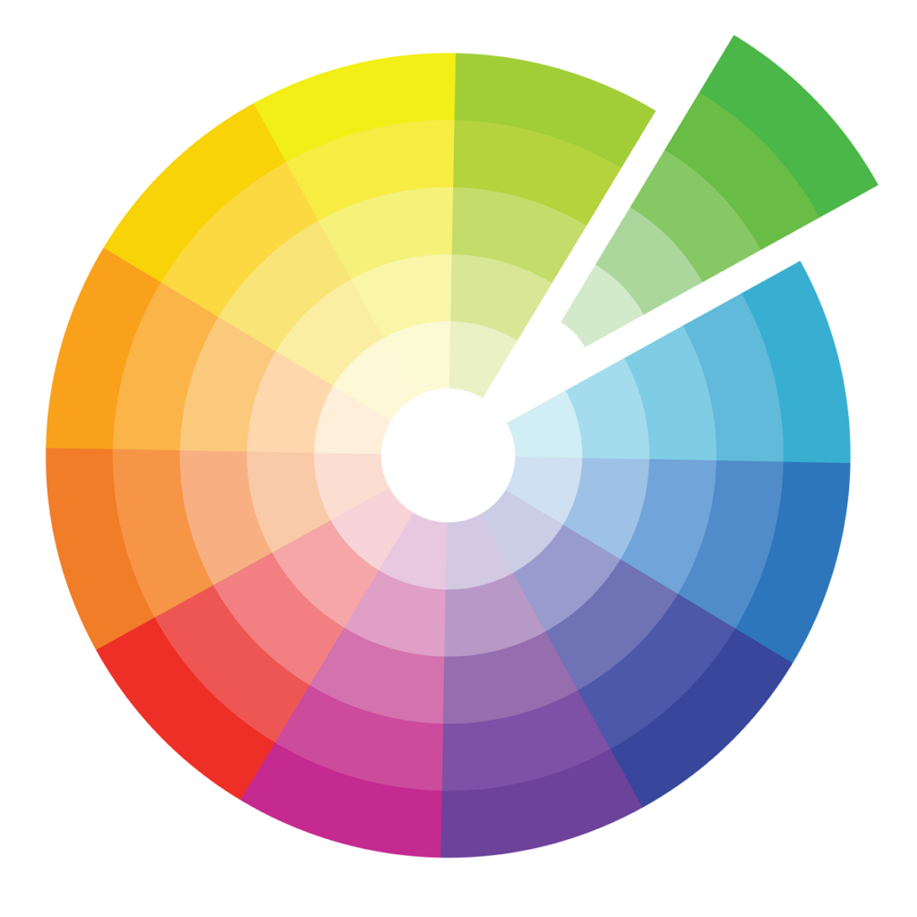

Analogous: Uses hues that are touching each other on the color wheel. The general rule is to restrict it to one-quarter of the color wheel. Because it is restrictive, helps guarantee harmony of colors.
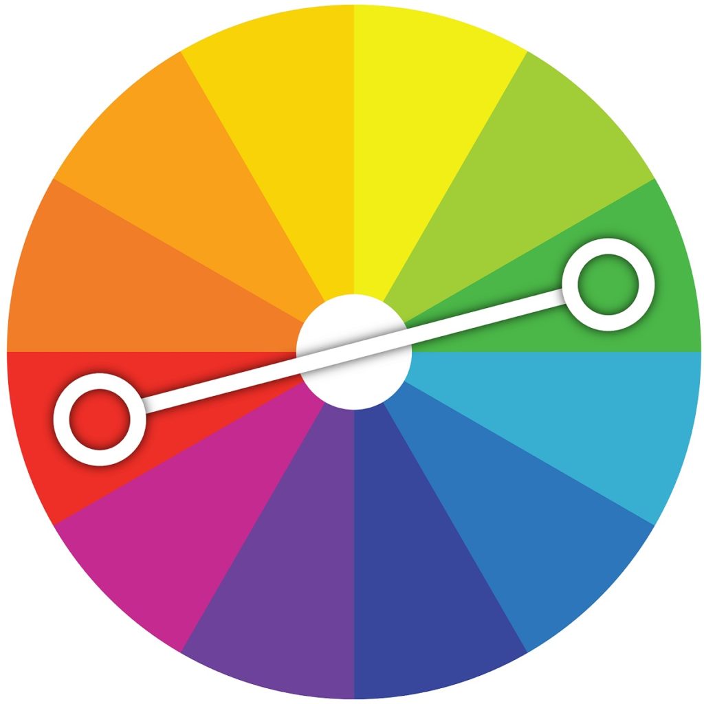
Complementary: Uses contrasting hues from opposite sides of the color wheel. Usually use a color of low saturation and low luminance to cover large areas and strong colors on the opposite side of the wheel for smaller areas.
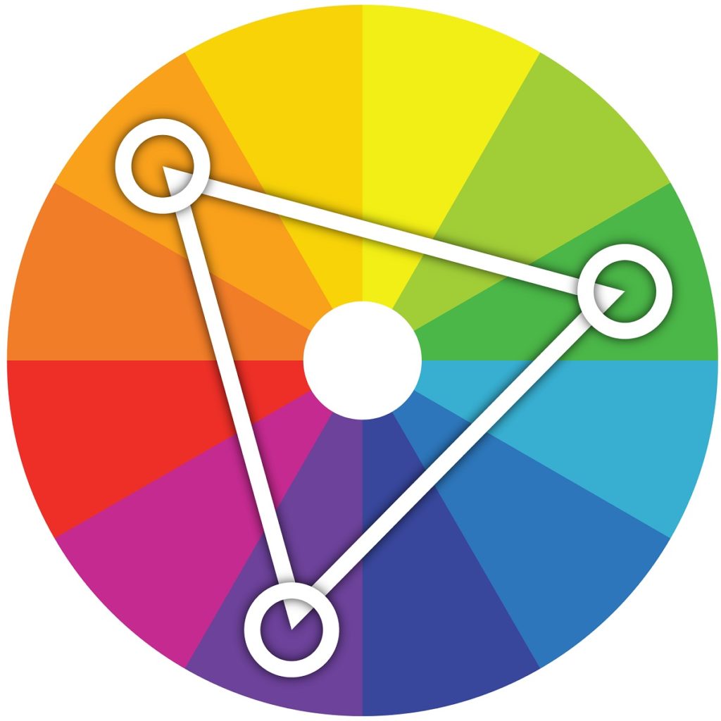
Triadic: Uses three hues equidistant from one another on the color wheel. Can be hard to get right. Triad schemes often have reduced hue intensities.
Tetrad: Uses four hues equally spaced around the color wheel. Not very common because it is difficult to produce in a way that is not confusing on the eye.
How Colors and Materials Work in Chief Architect
Before we can use color concepts to assist in designing spaces, we first need to understand how materials work in Chief Architect.
As mentioned earlier, in Chief Architect if a material is just a solid color, such as a paint color, the HSL and RGB values are assigned to what is called the Material Color. Some examples of downloadable catalogs from the Chief Architect 3D Library that only use a Material Color are Behr, Benjamin Moore, or Sherwin-Williams.


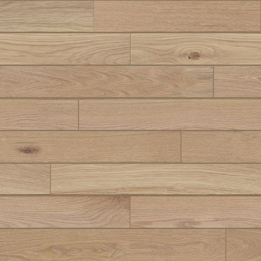
Materials, such as hardwood flooring, tile, roofing, and more, behave differently than solid colors, as these materials have varying colors and patterns such as wood grains, granite veins, grout lines, asphalt, etc. In Chief Architect these materials use what is called a texture, which is an actual image file of the material that stretches or repeats itself across a surface. Some examples of downloadable catalogs from the Chief Architect 3D Library that only use a Material Color are Cambria, Cultured Stone, James Hardie, or DalTile.
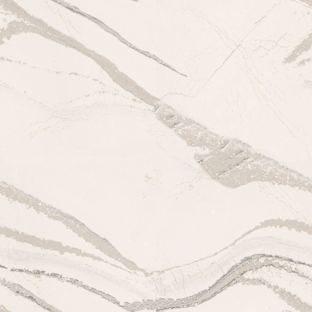
Materials that use a texture also have a Material Color because some 3D rendering techniques do not use the texture and instead rely on other settings to produce the 3D render. An example of this is the Vector View Rendering Technique, which does not use the texture and instead relies on the Material Color and a pattern of lines to produce the 3D render. Most of the time, the Material Color will closely match the dominant color present in the texture image. For example, a wood flooring texture is the actual image of the wood flooring and its Material Color will be a light brown hue that closely resembles the overall color of the texture.

Optionally, you can blend a texture with its Material Color. The purpose of this is to maintain the details in the texture while making it appear a different hue. An example of this is having a cabinet with a maple wood grain texture with a specific paint being used as the Material Color blended with it to make the maple wood grain appear a different shade.

Color and Material Features in Chief Architect
Chief Architect has many 3D rendering and material features for clients to visualize your Chief Architect designs.
3D Rendering
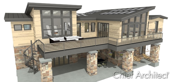
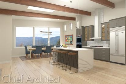
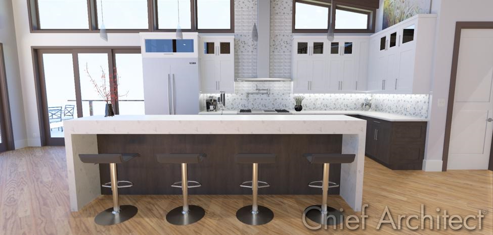
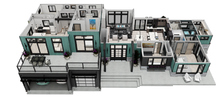
3D rendering is a powerful way to show clients what the design will look like. In Chief Architect there are nine different 3D Rendering Techniques that show various levels of detail about the design. Different 3D Rendering Techniques apply material settings differently and are used for different purposes. You can view examples of the different 3D Rendering Techniques and how they apply material settings differently in the photos below. Additionally, you can view more examples of 3D renders done in Chief Architect on the Samples Gallery. Detailed information about the nine 3D Rendering Techniques in Chief Architect is available in this video.
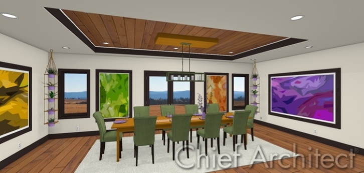
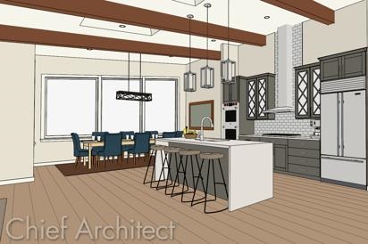
Chief Architect Standard Rendering Technique

Content
As mentioned earlier, you can download more content from the Chief Architect 3D Library. The Chief Architect content team works with many manufacturers to make their catalogs available in Chief Architect. You can learn about this process and how to request new manufacturers in this blog article. Additionally, you may be browsing the internet and see a solid color or material (such as wood flooring, tile, etc.) you would like to use in the program.
- For solid colors, you can create a custom color and take the HSL or RGB values (if available) and type them in to the Material Color field. If the HSL or RGB values are not available, there is an eyedropper that when activated allows you to hover your mouse over the online color and when clicked use it for the Material Color. Detailed information on creating custom colors is available here.
- For materials that use a texture image, such as flooring, tile, etc. you want to ensure that the texture image is a “seamless texture image” and not an image of an entire scene. A seamless texture image allows the image to cleanly stretch or repeat itself across a surface. Save the texture image to a safe spot on your computer. Next, in Chief create a new material and upload the texture image as the Texture Source. Detailed information on creating custom materials is available here.
Library Browser
The Library Browser holds all of the 3D objects and materials you download from the Chief Architect 3D Library or custom create. The Library Browser is broken up into four categories:
- The Core Catalogs is the content that downloads when you install the program.
- The Bonus Catalogs is content made in-house by the Chief Architect content team that can add more variety to your designs.
- The Manufacturer Catalogs is content from our manufacturer partners.
- The User Catalog is content you have custom created, modified, or just want quick access to. You can create a folder hierarchy in the User Catalog, making it easy to organize and access your favorite and custom content.
Detailed information about the Library Browser is available here.
Material Painter and Material Eyedropper
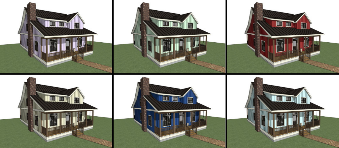
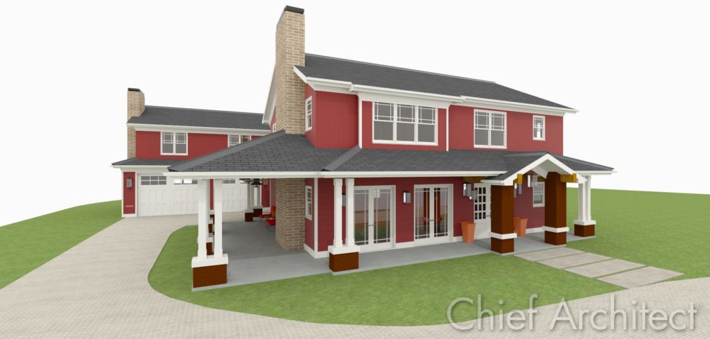
After you have obtained materials it is easy to apply them to your Plan. When you select a Material in the Library Browser, the Material Painter feature is activated and your mouse changes to a spray can icon indicating you are applying a Material. In the bottom left-hand corner, there are scoping modes for how you would like to replace an existing material in the Plan with your newly selected material. You can replace existing materials with the new material for a single component on an object, anywhere the existing material is at on an entire object, or anywhere the existing material is at in the room, floor, or plan wide. If the new material you are applying is a solid Material Color (such as a paint color), you can blend the new color with any textures in the Plan. There is also an option to copy the material, make edits to it, and apply the newly edited material. There is also a Material Eyedropper feature that allows you to select a material already in the Plan and then apply it using the Material Painter feature. Detailed instructions on using the Material Painter feature is available here.


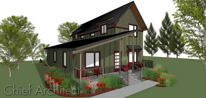
A house painted different colors using the Material Painter feature in Chief Architect
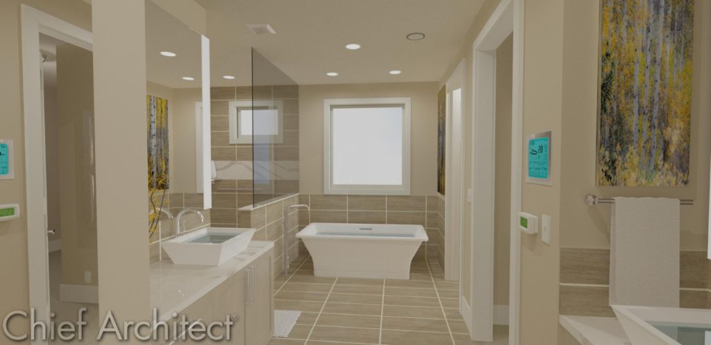
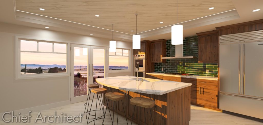
Style Palette
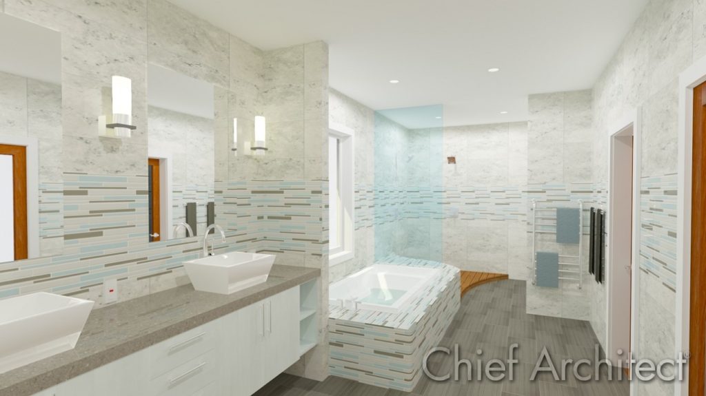
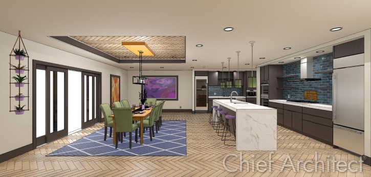
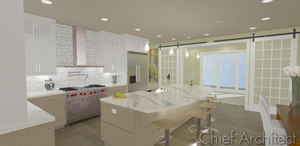
A unique tool in Chief Architect for creating material and color schemes that can quickly be applied to an entire space is the Style Palette tool. When creating a Style Palette, you configure the style and materials of cabinets, doors, windows, backsplashes, countertops, and rooms. Once a Style Palette is created, you select it from the Library Browser, select the scope of how you would like to apply it (to a single object, an entire room, an entire floor, or the entire plan), click to apply it and your scene will update. Using Style Palettes is a quick and easy way to show clients how changes in material and color schemes can impact the mood and perception of a space. A client may have particular materials or a color scheme they want for their space. Using your experience as a designer, you can create a Style Palette and incorporate the client’s desired materials, along with additional materials you’ve picked out, into a Style Palette to show the client how the space will look. Detailed information on using Style Palettes is available here.


A kitchen with various design styles using the Style Palette feature in Chief Architect
Crafting the perfect space for clients requires high attention to detail and knowing the charisma your client would like the space to express. The fundamental concepts of color and color schemes can serve as a guide when designing the perfect space for the client in Chief Architect.
Here is a summary of the resources discussed throughout this article.
- Download catalogs from the Chief Architect 3D Library.
- Information on how to request new manufacturer catalogs.
- Rendering technique examples in the Samples Gallery.
- Video about the nine rendering techniques in Chief Architect.
- How-to create custom colors in Chief Architect.
- How-to create custom materials in Chief Architect.
- How-to use the Library Browser in Chief Architect.
- How-to use the Material Painter in Chief Architect.
- How-to create and use Style Palettes in Chief Architect.
If you are new to Chief Architect or using an older version, you can download a trial to evaluate the features discussed through this article.


